Perfect harmony?

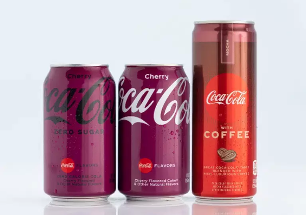
Oh no. Coca Cola’s redesign of its packaging has been met with stinging criticism.
One of the most recognisable brands on the planet, and its new identify “almost seems to get lost in the crowd.”
The company’s revelation of brand new packaging across the entire range of Coca-Cola drinks, along with a brand new flavour, Mocha, is causing a bit of debate online.
Many online commentators are expressing dismay at the designs. In some ways it was always going to be a lose-lose for Coca Cola. It’s very difficult to undertake a design to make Coca Cola’s flavours easier to differentiate, and to “modernise and simplify” the brand’s packaging.
Coca-Cola’s new cans and bottles feature full colours to “designate single flavours” and stacked colours to communicate “dual flavours” such as cherry vanilla.
But introducing a mix of colours instead of that instantly recognisable red could be a stretch too far.
The logo will save the day. But, wait. The company has also seen fit to change its iconic logo.
Ultimately, the brand is known well enough not to suffer too drastically. The match of distribution and formulation is what counts. The winning taste of cola is what brings people back time and again. Marry that with its reach in almost every sector of society and most people will purchase Coca Cola no matter what design is on this particular can.
- Rodney Jack, editor, Food & Drink Technology.
Keep in touch via email: [email protected] Twitter: @foodanddrinktec or LinkedIn: Food & Drink Technology magazine.


