Mattessons’ bold new look targets standout and growth
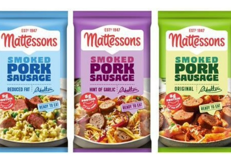
Mattessons has rolled out a full brand refresh designed to sharpen its shelf presence and reassert its role in the UK’s meat‑snacking category — a move owner Pilgrim’s Europe says is central to unlocking new growth and re-engaging shoppers.
Pilgrim’s Europe has been working to modernise and premiumise its branded portfolio, and Mattessons — one of its most recognisable consumer-facing assets — is a priority. The company says the redesign aims to:
- Strengthen brand visibility — clearer colour blocking, bolder typography and simplified pack architecture to help shoppers instantly identify Mattessons on shelf.
- Reassert category leadership — the brand has high awareness but needed a fresher, more contemporary identity to compete in a crowded protein-snacking space.
- Support innovation rollout — Pilgrim’s is preparing NPD and format updates, and the new look provides a unified platform for future launches.
- Appeal to younger shoppers — design cues have been updated to feel more energetic and modern, aligning with consumer trends around high-protein convenience snacks.
What’s changed
The brand has incorporated a new visual identity featuring cleaner lines, stronger colour contrast and a more confident wordmark. There is also a simplified pack hierarchy to make flavour and format navigation easier while a modernised brand tone emphasises protein, convenience and everyday snacking occasions.
Pilgrim’s Europe has been actively reshaping its branded portfolio, with Mattessons positioned as a core driver of value in chilled snacking. The refresh aligns with wider category trends:
- Rising demand for high‑protein, grab‑and‑go formats
- Increased competition from plant‑based and functional snacks
- Retailers pushing for clearer, more distinctive packaging to reduce shopper confusion
Pilgrim’s says the redesign is intended to “future-proof” Mattessons and ensure the brand remains relevant as consumer expectations shift.