Circumstance Distillery debuts rolling release and age statement
Circumstance Distillery has unveiled the latest expression in its grain whisky range — a barley-led single grain aged in Oloroso-conditioned casks — while simultaneously overhauling its packaging and transparency standards.
The release marks a shift for the Bristol distillery as it navigates the maturing landscape of the English whisky category.
Answering the “Age” question
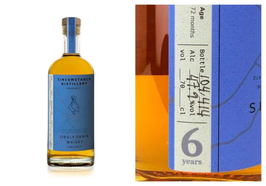
The most significant change to the distillery’s presentation is the introduction of a clear age statement on the bottle. While the distillery has always included age data within its bottle coding system, the team decided to move it to the primary label to satisfy a common consumer query: “How old is it?”.
The decision is also rooted in the distillery’s dual role as a producer and retailer. Following the reopening of its Bristol-based bottle shop and bar, increased footfall in warmer weather prompted the need for customers to access essential product information quickly.
However, founder Liam Hirt cautions that the number on the label is secondary to the craft: “Older doesn’t necessarily mean better,” says Hirt. “Ultimately, we’d rather people focus on how whisky is made and what it tastes like than just the number on the label. This update makes it easier to identify at a glance”.
The “rolling release” philosophy
Unlike traditional one-off limited editions, Circumstance utilises a rolling release model. These whiskies are launched in sequential batches that evolve incrementally over time.
- Batch evolution: each release builds on the previous one while maintaining a core identity.
- Ongoing narrative: the distillery views these not as finite products, but as part of an ongoing journey.
- Spirit profile: the latest barley-led single grain offers richness and layered sweetness from the Oloroso cask, which the distillery recommends serving with soda and a slice of orange for a lighter, “weather-appropriate” serve.
Packaging refreshed for darker spirits
The latest release also debuts a transition from the distillery’s signature etched glass to a new paper-label design. While the etched aesthetic was effective for lighter spirits, the team found it less legible as their whisky expressions became darker with maturity.
The new label was designed entirely in-house, translating the original visual cues onto premium paper stock without the use of external agencies or focus groups. This commitment to flavour-led and craft production remains the core of the brand as the English whisky industry continues to gain international recognition and maturity.